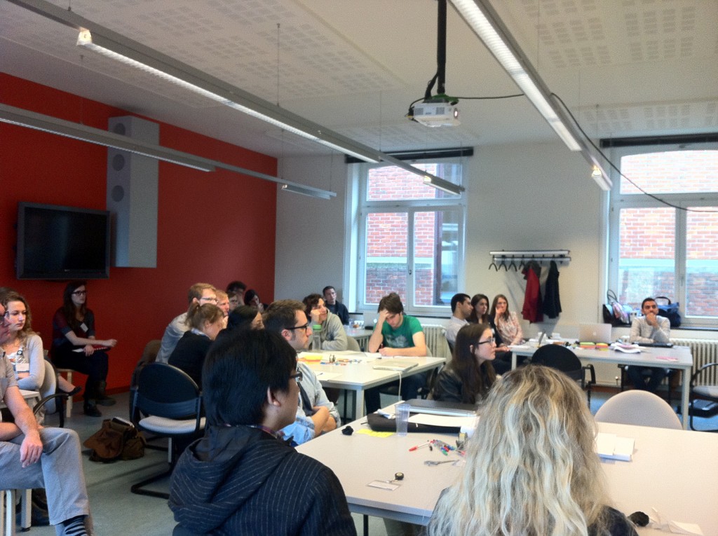
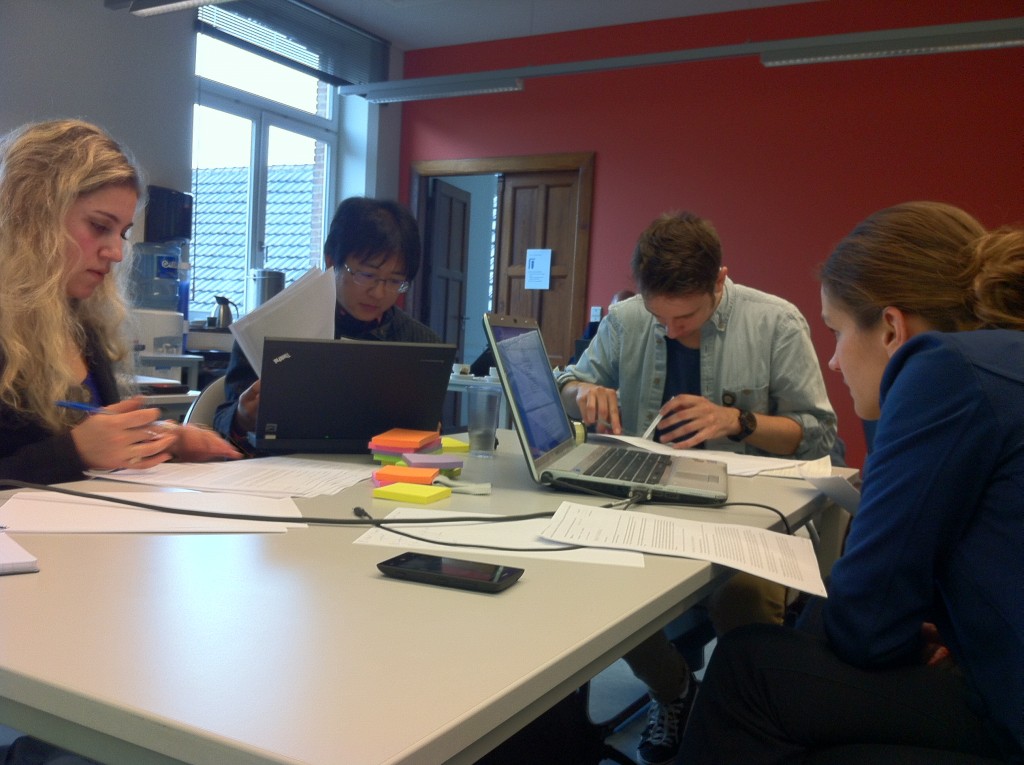
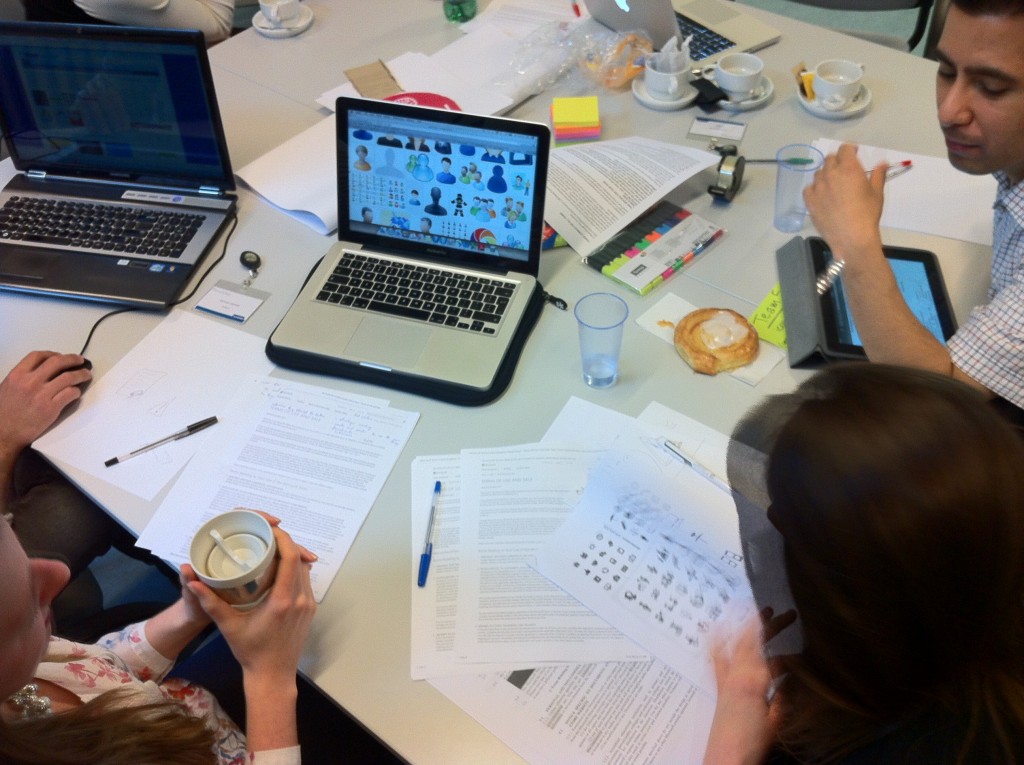
The first Belgian Legal Design Jam has been organized on 4th April, in beautiful and ancient Leuven. The Jam was hosted at KU Leuven by the Interdisciplinary Centre for Law and ICT (ICRI) and it was aimed at providing the students of the LLM Research Master in Law (KU Leuven and Tilburg University) with a hands-on experience of how design thinking and doing can be applied to make legal texts more user-friendly.
A big thanks for making this Jam possible goes to ICRI’s superladies Veronica Donoso Navarrete, Ellen Wauters, Shuki Tang and Prof. Peggy Valcke, as well as Microsoft EMEA, who provided us the chance to work on their Terms of Use and Sale from the Microsoft Online Store.
Partcipants
Our beautiful Jammers included the students of the LLM Research Master in Law Fay Kartner, Edmée Braakman, Rafaela Steffen Goncalves da Rosa, Jian Zhang, Reinout Leys, Sien Peeters, Mathieu Tulpinck, Lies Van Welde, Eva van Vugt, Marlou Brokx, Anouk Sterks, Renate Dietvorst, Ave-Geidi Jallai, Ronal Van Crombrugge, Lodewijk Van Dycke, Sören Vandeweyer, Steven Verschoot, Anna Butenko, Ali Tahami and Olga Krupnytska. Additionally, we made sure that we could keep our multidisciplinary spirit thanks to the participation of designers and coders Sandy Claes, Giacomo Gabrielli, Inke Coolen, Tania Van Denhouwe and Sermet Cakmak. KU Leuven researchers Ellen Wauters, Veronica Donoso, Marten Van Mechelen, Valerie Verdoodt and Prof. Andrew van De Moere acted as facilitators. Last but not least, Microsoft Attorney Nick Owers kindly joined the Jam in order to provide some useful background about the Terms and their use.
Scope of the Jam and results
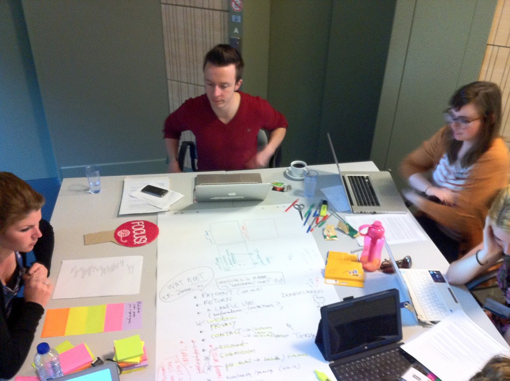
During this Jam we worked on the Terms of Use and Sale from the Microsoft Online Store, thinking of different ways to make the document more user-friendly. Six teams worked complementary, each at improving a particular aspect of the document. The teams had only 3 hours of work to move from concept and paper sketches to a digital mock-up of their proposed solution, but they succeeded brilliantly in coming up with concrete, fresh ideas.
Team “User-friendly summary”
The challenge picked up by this team was to create a user-friendly summary to create a easy-access, visually pleasant overview of the content of the Terms of Use. Users without a legal background find it hard to read through a long legal document to find the information that interest them: a user-friendly summary provides a simpler overview of the topic, so the readers can find their “direction” through the clauses and drill-down only when it matters.
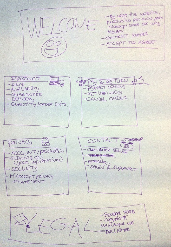
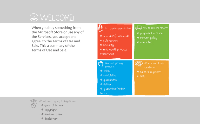
The team thought of a visual user-friendly summary inspired by Microsoft’s tiles motiv. In their proposal, they suggest that every topic in the summary works as a link to the relevant text.
Below, you can see the paper sketch and the finalized digital mock-up of this idea.
Team “Purchase policy”
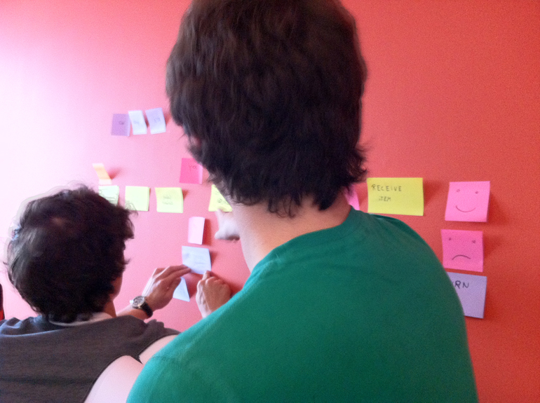
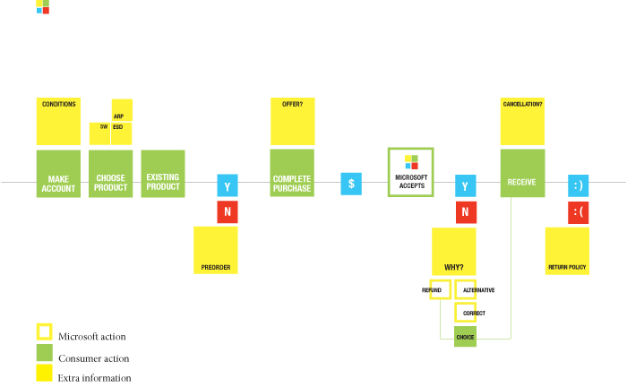
The challenge of this team was to guide the users through the purchase process of goods, software and services in the Microsoft Store. Depending of what is being purchased, the “rules” will be a bit different, so there is a need to communicate these differences to customers in a simple way. The team chose to develop a flowchart, keeping in the middle, in green, the actions performed by customers during the purchase process, step by step. Additionally, the yellow tiles represent the extra information the customer needs to know in relation of each choice or action made.
Also this team envisioned that the flowchart would be better implemented as an interactive visualization, so that users can click on each tile to get, firstly, a plain language explanation of what it means, and, eventually, access the original clause of the Terms of Use in order to get all the details. Layering makes it possible for every single user to read only the amount of information they are looking for, no more, no less.
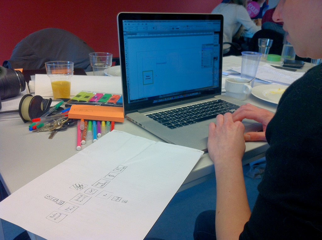
Below, you can see how the team went from a post-it draft to the finalized digital mock-up of this idea.
Team “Return & Refund policy”
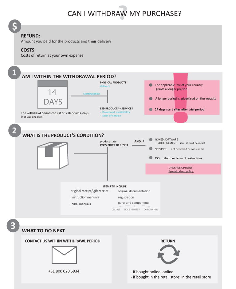
But what happens if the purchase process doesn’t go completely smoothly, and the customer wants to return the product? One of the teams took up the challenge to explain in a simple way what to do, and which rules to follow, in order to get a refund. Consumers are often worried that there is going to be some fine print preventing them to return the product: presenting information in a transparent, simple way can go a long way in improving customer experience and service!
Teams “Layout” and “Icons”
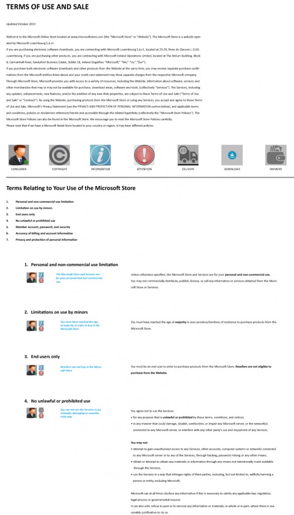
Last but not least, the presentation of the original text of the Terms of Use also needs to be well designed, and avoid the “wall of text” first impression, which can easily scare readers away. The two remaining teams worked at a clearer, less cluttered layout, and at a system of icons, which, by providing salient “visual anchors”, can make the text more transparent and memorable.
Below, an excerpt of the policy is presented in the proposed layout, and the icon system is integrated with the text.
And now?
And now we hope these ideas will be used somehow at Microsoft, whenever their Terms of Use will be updated, either as food for thought or (even better!) as concrete ideas to build upon! The Wikimedia Foundation has been the first organization to incorporate ideas created during a Legal Design Jam in their Trademark Policy (read more here and here), showing that it is possible to work towards the legal documents that users need and deserve. We hope many other organizations will follow in these steps and produce user-friendlier, transparent, useful legal documents for its customers and users.

