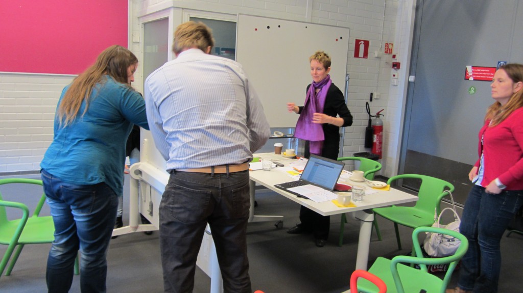
This Jam was organized as part of the the VISO Research Project, carried out by the Simlab unit at Aalto University School of Science. This Jam was tailored mostly for civil servants and procurement experts from public organizations, and took place in the inspiring spaces of Aalto Design Factory.
Participants
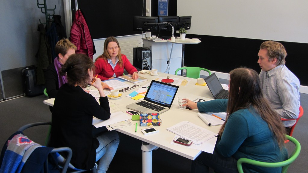
Our Jammers of the day were researchers Soile Pohjonen, Marika Noso and Nora Arlander; procurement experts Charlotta Tuovinen, Antti Tuukkanen, Jani Martikainen, Sari Aartolahti; designer Ruta Kirsnyte; design students Eeva-Maria Piiparinen and Nina Wester.
Scope of the Jam
This was a short afternoon Jam, so we concentrated on a document that would not be too long or complex. The candidate for redesign were the instructions for using the procurement portal Hilma, which is the site where all Finnish public procurement announcements and request for tender have to be made public.
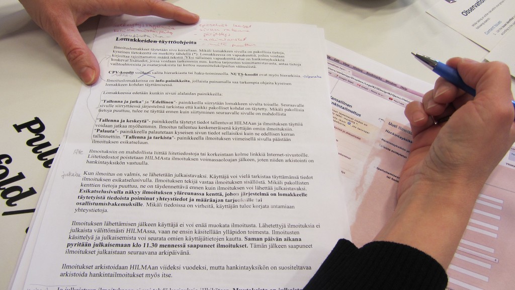
These instructions have several problems. Firstly, they are placed under the “fill in an announcement” link, and not under a “read instructions” link: clearly, they are going to be ignored by those who already made their mind about filling the procurement announcement form, and they are not going to be found by those searching explicitly for instructions.
Secondly, the text is just a wall of text: very little paragraphing, no clear headings, no visible structure… it is very easy to ignore this text even if it appears on your screen!
Thirdly, the instructions are provided before filling in the form, and they are not easily at hand while performing that task. However, many doubts and questions could arise while filling in the form. So why not providing guidance in a more contextualized, need-to basis?
Results & prototypes
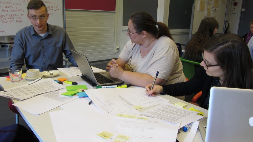
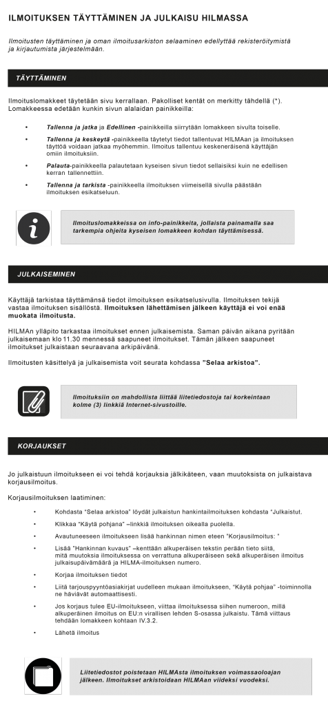
One of our teams worked on making the instructions more visual, simpler and appealing. The style is still official and professional, but different visual elements create better a structure and a more overall pleasant look.
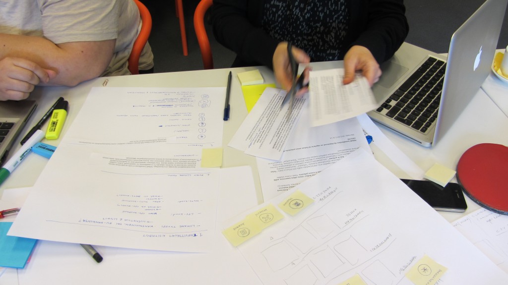
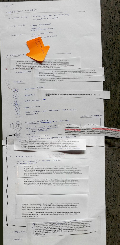
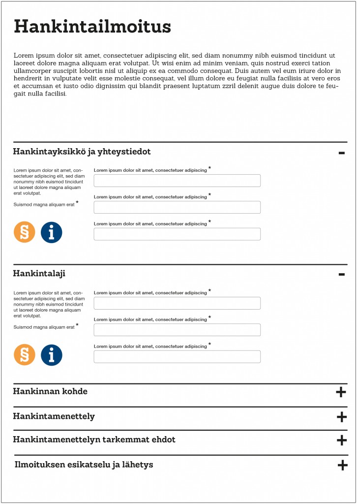
Our second team instead worked on how to better integrate the instructions in the process of filling the procurement announcement form. Since the Jam was quite short and the idea quite ambitious, the team created a paper prototype in order to give shape to their idea as effectively as possible and figure out the overall information structure that would be needed for a redesign. Then, they complemented it with a mock-up layout for the procurement form, which uses color, icons and typefaces to make the form more user-friendly and pleasant.

