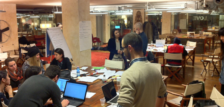
This Jam was the first of the two organized in Milano last February, the other one being held the day after at Talent Garden.
It was exciting as it was the first time that the absolute majority of the participants were designers, and it was particularly exciting because they were design students from the Master in Visual Brand Design at Domus Academy. I think that it is very important to propose unconventional subjects and experiences to students, and show them how wide the concept of “design” can really be. In this regards, a big thanks goes to the always forward-looking Stefano Cardini, the director of the master programme, and a former teacher of mine, who asked me to work with his students .
The other big thanks goes to Giorgio Trono, the Milan-based lawyer who requested, co-ideated and helped me organize both sessions in Milano, and Pier Bardoni, CEO of the innovative physical/digital design agency THINGS, who provided us with a beautiful and inspiring workspace!
Participants
Our beautiful Jammers included Visual Brand Design students Agra Satria, Anna Weckerle, Arber Racaj, Ebru Turgul, Josh Boaz, Martha Issa, Ray Yen, Teerin Pornpattananangkul, Thedy Martha Dinata, Yuan Yue; law student Alex Brandolino and PhD candidate Maria Schmidt-Kessen; lawyers Umberto Piattelli and Laura Quintavalla from international law firm Osborne Clarke, and us organizers and facilitators Stefania Passera, Giorgio Trono, Stefano Cardini and Pier Bardoni
Scope of the Jam and results
During this Jam we tackled the Consob regulation about Crowdfunding, thinking of ways to make it more user-friendly, readable and useful for its target group.
First, the students had to understand who the main target group of this document was: despite being written in the usual legalese style, the regulation is aimed at companies who wish to create platforms where startups can get connected with investors, by raising capital in exchange of shares.
This led one student team to focus on clarifying the registration process that companies wishing to establishing such platforms need to go through. This is very important for the target group, as errors in the application can lead to delay in getting the permission to start operations, and thus start making profit. The first step was to sketch down on paper different ideas for a summarizing diagram guiding the reader to the process…
… and then creating a digital mock-up of their chosen idea (click on the image below to enlarge). Ideally, now the diagram is ready for user testing, to check with target users if the process is clear and to integrate their comments to improve it further.
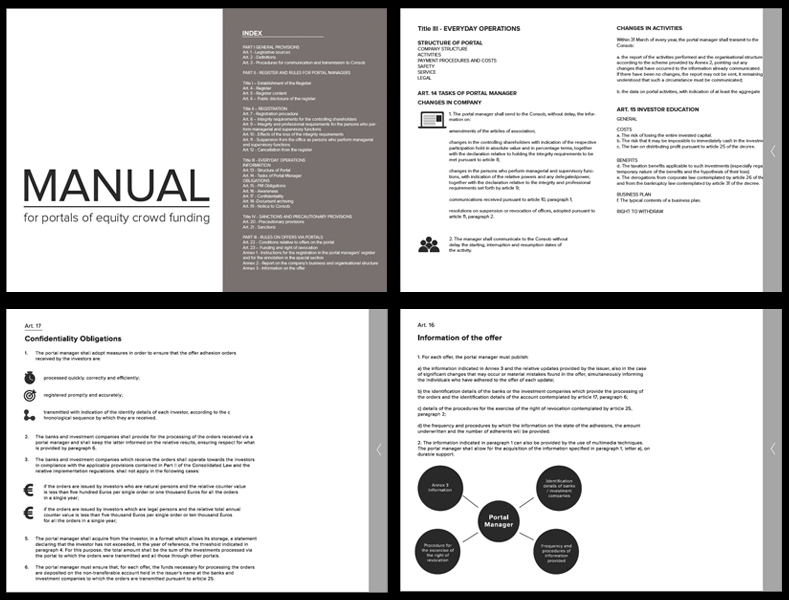
A second team instead focused on producing an improved, interactive layout for the whole text of the regulation. The current document does not exploits fully the digital medium in order to order, layer and structure the information, but simply uses the webpage space as it would be a long piece of paper. The students created a mock up proposal in which the text is reorganized in a better order and is integrated with icons and diagrams, calling it “manual” in order to more directly engage with the target users and communicate that these are not simply rules to obey, but they can get support to learn “how to” do the right thing. The current mock-up, for obvious time constraints, only shows selected parts of the document and was implemented as an interactive PDF.
(click the image below to open the PDF)
An interesting discussion that arose was how to maintain consistency between digital and printed versions of the regulation. While one can easily integrate links in a digital version, how can we provide easy access to relevant linked laws, rules and other documents? One simple idea (that unfortunately only remained a paper sketch) would be to utilize a 3 column layout, organized in this way: the left column is dedicated to paragraph headings and plain language summaries of what the paragraph is about, the central column contains the text of the regulation, the right column includes extracts of relevant referenced sources, adding a QR code that can let the reader access the whole referenced document for further context and details.
Last but not least, a user-friendly summary of the regulation was created. This chart explains in a nutshell the key contents of the document in relation to the actions that companies need to do in order to start and run their business. Since the focus of this chart is on the “how to” get done required actions effectively and efficiently, it also points out which annexed checklists can be used for different goals. Of course, this summary is minimalistic and leaves out lots of details, but it is a way to provide a meaningful into the content at a glance.
All the contributions are released under Creative Commons Attribution-NonCommercial-ShareAlike, meaning that, if you like what you see, you can share it and even build on this existing material (as long as you don’t sell it), as long as you credit the original work as follows:
“© 2014 Legal Design Jam participants @Milano 10.02.2014”


